 なるWeb
なるWeb 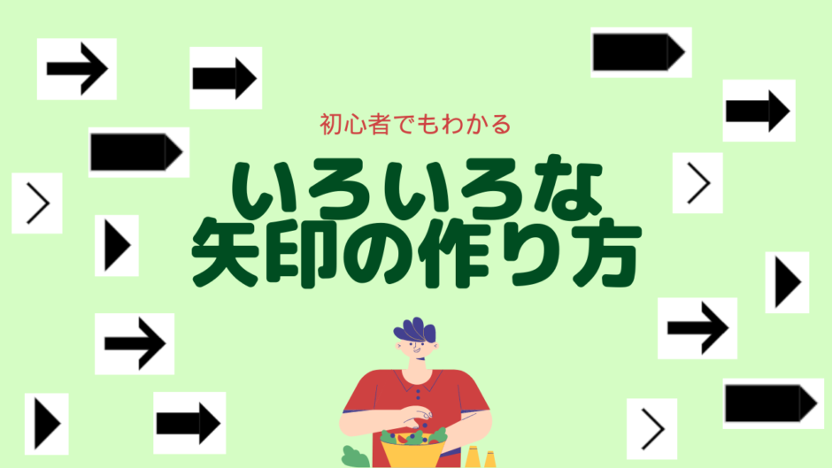
どうも7noteです。▶とか→とか>をCSSで再現する方法
文字ではなく、CSSでいろいろな矢印を作っていきます。
① 「▶」の作り方
style.css
span {
  width: 0;
  heigth: 0;
  border: solid 10px transparent; /* 矢印の大きさを変更できる */
  border-left-color: #000; /* 矢印の色を変更できる */
  display: inline-block;
}下向き「▼」を作るときは、border-left-color: #000;をborder-top-color: #000;にしてください。
上下と左右でborderの数値を変えるともっと尖った三角も作れます。

② 「➡」の作り方
style.css
span {
  display: flex;
  align-items: center;
}
span::before {
  content: "";
  width: 20px;
  height: 10px;
  background: #000;
  display: inline-block;
}
span::after {
  content: "";
  width: 0;
  height: 0;
  border: solid 10px transparent;
  border-left-color: #000;
  display: inline-block;
}
もしくは、
style.css
span {
  position: relative;
}

span::before {
  content: "";
  width: 20px;
  height: 10px;
  background: #000;
  display: inline-block;
  position: absolute;
  top: 5px;
  left: 0;
}

span::after {
  content: "";
  width: 0;
  height: 0;
  border: solid 10px transparent;
  border-left-color: #000;
  display: inline-block;
  position: absolute;
  top: 0;
  left: 20px;
}
上向き⬆か下向き⬇を作る時は後者の方法を使って上下に配置する方法があります。
③ 「→」の作り方
style.css
span {
  position: relative;
}
span::before {
  content: "";
  width: 20px;
  height: 5px;
  background: #000;
  display: inline-block;
  position: absolute;
  top: 5px;
  left: 0;
}
span::after {
  content: "";
  width: 9px;
  height: 9px;
  border: solid 3px transparent;
  border-right-color: #000;
  border-top-color: #000;
  display: inline-block;
  position: absolute;
  top: 0;
  left: 6px;
  transform: rotate(45deg);
}
■と>を合体させて作ります。
環境によってはすこし微調整が難しいかもしれないのであまりおすすめはできません。

④ 「■▶」の作り方
style.css
span {
  display: flex;
  align-items: center;
}
span::before {
  content: "";
  width: 20px;
  height: 10px;
  background: #000;
  display: inline-block;
}
span::after {
  content: "";
  width: 0;
  height: 0;
  border: solid 5px transparent;
  border-left-color: #000;
  display: inline-block;
}
作り方は➡とさほど変わらないので省略

⑤ 「>」の作り方
style.css
span {
  width: 10px;
  height: 10px;
  border-right: 1px solid #000;
  border-top: 1px solid #000;
  display: inline-block;
  transform: rotate(45deg);
}
「>」の作り方は過去に記事をまとめてますので、よければこちらもどうぞ。
【初心者でもわかる】HTML・CSSで「 >(逆くの字矢印)」の5つの作り方

まとめ
矢印って、CSSで書くとやっぱり大変なので、小さいのは画像でもいいかもしれませんね。
でもやっぱりCSSで書きたくなる時がくるので、コピペで簡単に作れるよう準備しておくのが良いかも!
また他の矢印作りに出会ったら追加しておきます。