 なるWeb
なるWeb 
どうも7noteです。あまり使う機会は少ないかもですが、CSSだけで6角形の作り方について
CSSだけで6角形を作ります。6角形は英語でヘキサゴン!
8角形も似たような方法で作ったのでよければ見てってください。
cssだけで6角形を作る
index.html
<div class="hexagon">
  <div class="hexagon_frame"></div>
</div>
style.css
.hexagon {
  width: 69px;
  height: 80px;
  background: #000; /* 6角形の色 */
  position: relative;
}
.hexagon::before {
  content: '';
  width: 0;
  height: 0;
  border-top: 10px solid #fff;
  border-left: 17px solid #fff;
  border-bottom: 10px solid transparent;
  border-right: 17px solid transparent;
  position: absolute;
  top: 0;
  left: 0;
}
.hexagon::after {
  content: '';
  width: 0;
  height: 0;
  border-top: 10px solid #fff;
  border-left: 17px solid transparent;
  border-bottom: 10px solid transparent;
  border-right: 17px solid #fff;
  position: absolute;
  top: 0;
  right: 0;
}

.hexagon_frame::before {
  content: '';
  width: 0;
  height: 0;
  border-top: 10px solid transparent;
  border-left: 17px solid #fff;
  border-bottom: 10px solid #fff;
  border-right: 17px solid transparent;
  position: absolute;
  bottom: 0;
  left: 0;
}
.hexagon_frame::after {
  content: '';
  width: 0;
  height: 0;
  border-top: 10px solid transparent;
  border-left: 17px solid transparent;
  border-bottom: 10px solid #fff;
  border-right: 17px solid #fff;
  position: absolute;
  bottom: 0;
  right: 0;
}
結果

この方法でハニカム構造にするにはちょっとしんどいかも。できなくはないが・・・
もう一つ疑似要素を使った方法
index.html
<div class="hexagon"></div>style.css
.hexagon {
  width: 70px;
  height: 40px;
  background: #000;
  position: relative;
}
.hexagon::before {
  content: '';
  width: 0;
  height: 0;
  border-top: 0 solid transparent;
  border-left: 35px solid transparent;
  border-bottom: 20px solid #000;
  border-right: 35px solid transparent;
  position: absolute;
  top: -20px;
  left: 0;
}
.hexagon::after {
  content: '';
  width: 0;
  height: 0;
  border-top: 20px solid #000;
  border-left: 35px solid transparent;
  border-bottom: 0 solid transparent;
  border-right: 35px solid transparent;
  position: absolute;
  bottom: -20px;
  left: 0;
}まとめ
どちらの方法も擬似要素を使った方法です。
1つ目の方法は、背景と同じ色の三角形で削り取って6角形に見せかけている方法。
2つ目の方法は、逆に四角形に三角形を2つ上下に重ね、6角形に見せかけている方法。
どちらもだいたい6角形に見えるだけで、数値的には正6角形ではありませんが、WEBで使用する分にはさほど問題ないと思います。
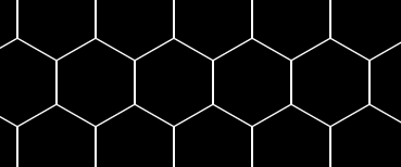
おまけ
2つ目の方法でハニカム構造を作ってみた。
index.html
<ul>
  <li>
    <div class="hexagon"></div><div class="hexagon"></div><div class="hexagon"></div><div class="hexagon"></div><div class="hexagon"></div><div class="hexagon"></div>
  </li>
  <li>
    <div class="hexagon"></div><div class="hexagon"></div><div class="hexagon"></div><div class="hexagon"></div><div class="hexagon"></div><div class="hexagon"></div>
  </li>
  <li>
    <div class="hexagon"></div><div class="hexagon"></div><div class="hexagon"></div><div class="hexagon"></div><div class="hexagon"></div><div class="hexagon"></div>
  </li>
</ul>
style.css
ul li {
  margin-bottom: 15px;
  list-style: none;
}

ul li:nth-child(odd) {
  margin-left: -36px;
}


.hexagon {
  width: 70px;
  height: 40px;
  background: #000;
  position: relative;
  margin-right: 2px;
  display: inline-block;  /* 追記 */
}
.hexagon::before {
  content: '';
  width: 0;
  height: 0;
  border-top: 0 solid transparent;
  border-left: 35px solid transparent;
  border-bottom: 20px solid #000;
  border-right: 35px solid transparent;
  position: absolute;
  top: -20px;
  left: 0;
}
.hexagon::after {
  content: '';
  width: 0;
  height: 0;
  border-top: 20px solid #000;
  border-left: 35px solid transparent;
  border-bottom: 0 solid transparent;
  border-right: 35px solid transparent;
  position: absolute;
  bottom: -20px;
  left: 0;
}