 なるWeb
なるWeb 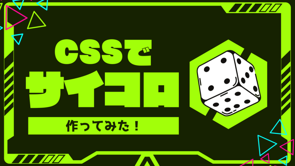
どうも7noteです。立方体の作り方
サイコロを作ったり、写真をはめ込んだ立方体を作ったりすることができます。
作ったことがなかったので、作り方を調べたので記録代わりに投稿。
使い方をマスターすればいろいろなものが作れそう。
①線のみVer.

index.html
<div class="box">
  <div class="item"></div>
  <div class="item"></div>
  <div class="item"></div>
</div>
style.css
.box {
  display:block;
  position:relative;
  margin:30px auto 0;
  width:100px;
  height:100px;
  transform-style:preserve-3d;
  transform:rotateX(-25deg) rotateY(-45deg); /* ここで四角の角度を調整できる */
}

.box .item {
  position:absolute;
  left:0;
  right:0;
  box-sizing:border-box;
  border:1px solid #333;
  width:100%;
  height:100%;
}

/* 上 */
.box .item:nth-child(1) {
  transform:translate3d(0, -50px, 0) rotateX(-90deg);
}

/* 左 */
.box .item:nth-child(2) {
  transform:translate3d(0, 0, 50px);
}

/* 右 */
.box .item:nth-child(3) {
  transform:translate3d(50px, 0, 0) rotateY(90deg);
}
②色付きVer.

style.css
/* ①に↓を追記 */
.box {
  background: #ccc;
}
※各面で違う色や背景画像を指定することも可。
その場合は各nth-child()の指定があるところにbackgroundを指定。
③文字入りVer.

index.html
<div class="box">
  <div class="item">1</div>
  <div class="item">2</div>
  <div class="item">3</div>
</div>
style.css
/* ①に↓を追記 */
.box {
  display:flex;
  flex-direction:row;
  align-items:center;
  justify-content:center;
}
④サイコロVer.

style.css
/* 画像を用意して①に↓を追記 */

/* 上 */
.box .item:nth-child(1) {
  background: url(sai1.png) no-repeat center center / 100% 100%;
}

/* 左 */
.box .item:nth-child(2) {
  background: url(sai2.png) no-repeat center center / 100% 100%;
}

/* 右 */
.box .item:nth-child(3) {
  background: url(sai3.png) no-repeat center center / 100% 100%;
}
※画像は一番下にあります。
⑤サイコロ アニメーションVer.

index.html
<div class="dice">
  <div class="item"></div>
  <div class="item"></div>
  <div class="item"></div>
  <div class="item"></div>
  <div class="item"></div>
  <div class="item"></div>
</div>
style.css
.dice {
  display:block;
  position:relative;
  margin:30px auto 0;
  width:100px;
  height:100px;
  transform-style:preserve-3d;
  transform:rotateX(360deg) rotateY(360deg) rotateZ(720deg);
  animation:rotate-animation 2s linear infinite;
}

.dice .item {
  position:absolute;
  left:0;
  right:0;
  border: 1px solid #333;
  box-sizing:border-box;
  width:100%;
  height:100%;
}

/* 1 */
.dice .item:nth-child(1) {
  transform:translate3d(0, -50px, 0) rotateX(-90deg);
  background: url(sai1.png) no-repeat center center / 100% 100%;
}

/* 2 */
.dice .item:nth-child(2) {
  transform:translate3d(0, 0, 50px);
  background: url(sai2.png) no-repeat center center / 100% 100%;
}

/* 3 */
.dice .item:nth-child(3) {
  transform:translate3d(50px, 0, 0) rotateY(90deg);
  background: url(sai3.png) no-repeat center center / 100% 100%;
}

/* 4 */
.dice .item:nth-child(4) {
  transform:translate3d(-50px, 0, 0) rotateY(-90deg);
  background: url(sai4.png) no-repeat center center / 100% 100%;
}

/* 5 */
  .dice .item:nth-child(5) {
  transform:translate3d(0, 0, -50px) rotateY(180deg);
  background: url(sai5.png) no-repeat center center / 100% 100%;
}

/* 6 */
.dice .item:nth-child(6) {
  transform:translate3d(0, 50px, 0) rotateX(-90deg);
  background: url(sai6.png) no-repeat center center / 100% 100%;
}

@keyframes rotate-animation {
  from {
    transform:rotate3d(0);
  }

  to {
    transform:rotate3d(1, 1, 1, -360deg);
  }
}
感想
.2sくらいで超高速でアニメーションさせたら、桃鉄のサイコロ振る時みたいにできるよ。

あ〜〜桃鉄やりたい。
参考・素材
https://shanabrian.com/web/css3/transform-cube-dice.php
https://chicodeza.com/freeitems/saikoro-illust.html